CSS Gradient Techniques: Elevate Your Web Design
In the realm of web design, CSS3 gradients may not be a novelty, but their utilization has been hindered by the vexing issue of cross-browser compatibility. This obstacle, however, is now being surmounted. Within the realm of browsers, Safari, Chrome (Webkit), and Mozilla Firefox (starting from version 3.6) have paved the way for the incorporation of CSS gradients. This post endeavors to elucidate the art of employing CSS gradients across some of the most prominent web browsers: Firefox, Safari, Chrome, and even the surprising contender, IE.
The Rationale Behind CSS3 Gradients
Before delving into the technicalities, it’s worth pondering why one should embrace CSS3 gradients. If CSS can extricate you from the quagmire of extraneous images, it should unquestionably be regarded as an efficacious solution for your design. This is due to several compelling reasons:
- It leads to a reduction in HTTP requests;
- CSS gradients exhibit scalability, thereby alleviating potential headaches;
- CSS3 exudes an undeniable coolness factor.
Firefox Gradients Unveiled
“`css

-moz-linear-gradient( [<point> || <angle>,]? <stop>, <stop> [, <stop>]* )

-moz-radial-gradient( [<position> || <angle>,]? [<shape> || <size>,]? <stop>, <stop>[, <stop>]* )

“`
Webkit Gradients Demystified
“`css

-webkit-gradient(<type>, <point> [, <radius>]?, <point> [, <radius>]? [, <stop>]*)

“`
IE Trident Gradient Example
A word of advice: It’s prudent to deploy these filters solely in conditional CSS files to avert any adverse impact on your file’s performance.
“`css
filter: progid:DXImageTransform.Microsoft.gradient(GradientType=0, startColorstr=#6191bf, endColorstr=#cde6f9); /* IE6 & IE7 */
-ms-filter: “progid:DXImageTransform.Microsoft.gradient (GradientType=0, startColorstr=#6191bf, endColorstr=#cde6f9)”; /* IE8 */
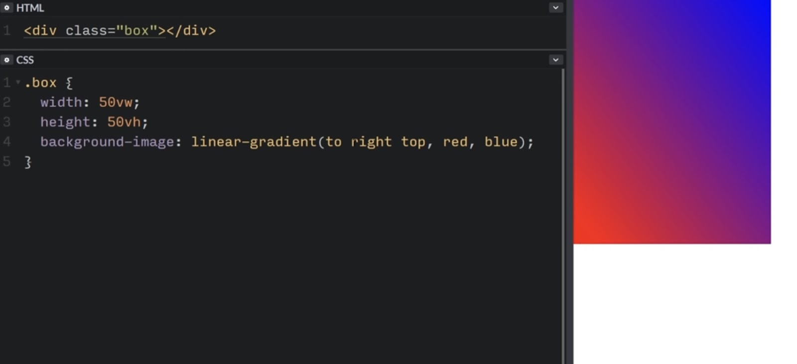
“`Crafting Cross-Browser CSS Linear Gradient
Now, let’s explore how this works in practice. By combining the following code snippets, you can achieve a cross-browser gradient box.
“`css

background: #6191bf; /* Fallback background color for non-supported browsers */

background-image: -moz-linear-gradient(top, #81a8cb, #cde6f9); /* Firefox 3.6 */

background-image: -webkit-gradient(linear, left bottom, left top, color-stop(0, #cde6f9), color-stop(1, #81a8cb)); /* Safari & Chrome */

filter: progid:DXImageTransform.Microsoft.gradient(GradientType=0, startColorstr=’#81a8cb’, endColorstr=’#cde6f9′); /* IE6 & IE7 */

-ms-filter: “progid:DXImageTransform.Microsoft.gradient(GradientType=0, startColorstr=’#81a8cb’, endColorstr=’#cde6f9′)”; /* IE8 */

“`
CSS3 Radial Gradient Unveiled
It’s important to note that IE gradient filters lack support for color-stop, gradient angle, and radial gradients. Consequently, they can only accommodate horizontal and vertical linear gradients with two colors, one for the start and one for the end. Nonetheless, let’s explore how to define a CSS3 radial gradient for Firefox, Safari, and Chrome.
“`css

background: #6191bf; /* Fallback background color for non-supported browsers */

background-image: -moz-radial-gradient(center 45deg, circle cover, #cde6f9, #6191bf);

background-image: -webkit-gradient(radial, 50% 50%, 0, 50% 50%, 800, from(#cde6f9), to(#6191bf));

“`
In Conclusion
While CSS gradients offer remarkable possibilities, it’s imperative to acknowledge that not all browsers have embraced them wholeheartedly. Thus, when crafting your web design, don’t rely solely on CSS gradients. Always have a reliable fallback strategy in place. This ensures that your website remains accessible and visually appealing across various browsers, including those that may not fully support CSS gradients.
One effective fallback strategy involves providing alternative styling or images for browsers that do not support CSS gradients. This ensures a consistent user experience regardless of the browser being used. Additionally, consider using feature detection techniques to identify the capabilities of the user’s browser and apply CSS gradients selectively.
Collaborative sharing of insights is invaluable in the ever-evolving field of web design. If you have experiences or tips related to using CSS gradients or alternative approaches, feel free to contribute in the comments below. Let your voice be heard and enrich the collective knowledge base.